

Manchester City vs Arsenal Analysis: How Manchester City Controlled Arsenal and Why This Was Predictable
This Manchester City vs Arsenal analysis is not just about a big game. It was a confirmation.
A few days ago, the argument was simple. Manchester City do not need to dominate headlines. They need to dominate structure. And when they do that consistently, results follow. From a Premier League analysis perspective, this match followed that pattern almost exactly. The scoreline was close. The control was not.
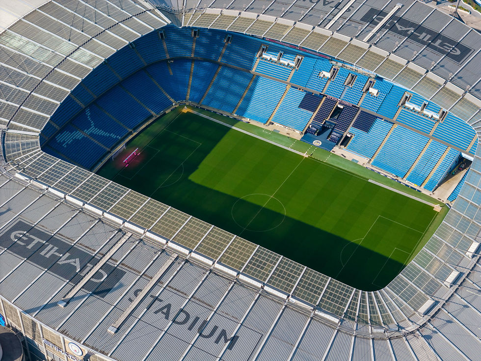
The easiest mistake to make with games like this is to focus on the moments. Cherki scores, Arsenal respond, Haaland wins it. It looks like a sequence of events.
It was not.
The game was decided earlier, in how often each team progressed the ball into dangerous areas and how consistently they held territorial control.
City did both better.
Instead of looking at goals, break the game into three repeatable elements:
· progression into final third · control of central zones · quality of shots created
You can think of it as a simple model:
Control Index = Progression + Central Presence + Chance Quality
City were higher in all three.
Metric | Manchester City | Arsenal |
Possession | 58% | 42% |
Shots | 15 | 9 |
High Quality Chances | Higher | Lower |
Central Zone Entries | Frequent | Limited |
Control Index (relative) | High | Medium |
This is what the Manchester City vs Arsenal game actually looked like from a data perspective.
Arsenal were not poor. They were just less consistent in reaching high value areas.
Where the game tilted
The biggest gap was in progression. Rodri’s influence shows up here again. Not through goals or assists, but through repeatable forward movement. Every time City progressed centrally, Arsenal’s shape had to retreat. Over time, that builds pressure.
Arsenal struggled to replicate this. Their attacks were pushed wider, which naturally lowers shot quality. That is why their equaliser felt like a moment, not a shift.
That difference between moment and pattern is everything.
Haaland and the illusion of the decisive moment
It is easy to say Haaland decided the game. He scored the winner. That is what people remember. But this links directly to my previous argument. Finishers do not create control. They convert it.
City had already increased the probability of a decisive chance. They had already established territorial dominance. The goal was a consequence of that structure. Haaland did what elite forwards do. City made it likely that he would get the chance to do it.
Why this fits my earlier prediction
I already pointed out that City tend to peak when control stabilises. Not when they score more, but when their progression and structure become consistent. That is exactly what this looked like. Not chaotic dominance. Controlled dominance. That is what wins title races.
For Arsenal, this is not a collapse. It is something more subtle.
Their progression into central areas is slightly less consistent in high pressure games. That forces them into lower probability shots. Over one match, that is fine. Across multiple matches, it costs points.
The title race is not decided here. But the pattern is.
City are controlling games at the right time of the season. Arsenal are still competitive, but slightly more dependent on moments.
That gap is small. But in title races, small gaps decide everything.
My take
What I said in January
A few weeks ago, in our January player analysis, the pattern was already clear. Manchester City win the league. Liverpool push them longer than expected. At least one relegation side survives because someone else collapses. The point was never the outcome. It was the pattern behind it.
This was not a game won by a goal. It was a game won by structure. City progressed better, controlled central spaces more often, and consistently created higher probability chances.
Haaland finished the story City had already started writing.
This Manchester City vs Arsenal analysis ultimately shows how structure, not moments, decides games at the highest level.


thapcamtv trực tiếp dạo này mình thấy có người nhắc tới khi nói về các nền tảng giải trí trực tuyến nên cũng thử mở vào xem cách họ bố trí giao diện ra sao. Mình không đi sâu vào nội dung hay từng trò cụ thể, mà chủ yếu quan sát cách các chuyên mục được phân chia trên trang và cách thông tin hiển thị cho người dùng. Nhìn tổng thể thì các khu như thể thao, casino, game bài hay slot thường được sắp xếp theo từng nhóm khá rõ, hiển thị dạng khối và danh sách nên lướt qua cũng dễ theo dõi. Các bảng dữ liệu được trình bày dạng cột khá gọn, giúp quan…
hit club mình thấy dạo này nhiều người nhắc nên cũng ghé thử cho biết, chủ yếu xem giao diện với cách họ trình bày thông tin thôi chứ chưa chơi gì. Vừa vào là thấy trang nhìn khá sáng sủa, chữ không bị dày đặc nên lướt nhanh cũng đỡ ngợp. Mấy mục quan trọng được chia theo từng khối rõ ràng, kéo xuống là hiểu họ đang nói gì mà không phải đọc quá kỹ. Có đoạn họ nhấn về bảo mật kiểu SSL 256-bit để ngay phần giới thiệu nên mình nhìn cái là thấy liền, cảm giác cũng yên tâm hơn chút. Menu đặt dễ thấy, bấm qua lại giữa các phần khá mượt, không bị…
luongson tv mình vừa lướt thử cho biết vì thấy bạn bè nhắc nhẹ, chủ yếu xem giao diện có dễ dùng không thôi. Vào trang cái là thấy bố cục khá thoáng, mấy khối nội dung chia ra rõ nên kéo xuống không bị rối mắt. Mình để ý cái menu đặt ngay chỗ dễ nhìn, bấm chuyển qua lại mấy mục nhanh, không phải mò lâu. Chữ với khoảng cách dòng nhìn ổn, kiểu liếc qua là nắm được ý chính chứ không bị dồn chữ sát nhau. Mình không ngồi đọc kỹ nội dung, nhưng cảm giác thao tác khá mượt, không bị “lạc” trong trang. Nói chung nhìn thân thiện, đơn giản vừa đủ, đặc biệt…
tỷ lệ kèo nhà cái mình thấy nhắc hoài nên tiện ghé vào xem thử cho biết, chủ yếu coi bố cục có dễ dùng không. Vào trang cái là thấy họ để phần kèo bóng đá hôm nay khá nổi, nhìn phát là biết đang có gì, khỏi phải bấm nhiều. Mình thích kiểu bảng hiển thị theo cột, số liệu nằm ngay ngắn nên lướt nhanh vẫn không bị hoa mắt. Có lúc mình muốn xem lại mấy kèo trước đó thì thấy có mục lịch sử kèo, đỡ phải kéo xuống mò lại từ đầu. Nói chung cảm giác trang làm gọn gàng, không bị nhồi chữ quá mức. Mấy khối nội dung như “Bài mới đăng”…
kèo nhà cái mình thấy bạn bè nói hoài nên bữa rảnh bấm vô coi thử cho biết. Mình không đọc kỹ nội dung đâu, chủ yếu xem họ làm giao diện ra sao thôi. Vừa vào là thấy trang nhìn khá sáng và dễ thở, chữ không bị dồn dập nên lướt nhanh cũng không mỏi mắt. Mấy phần thông tin được tách thành từng khối rõ ràng, kiểu nhìn cái là biết đang ở mục nào, không phải đoán. Mình cũng thích cái cách họ trình bày theo dạng bảng danh sách gọn gàng, số liệu hay kèo kèo gì đó nằm ngay ngắn nên bắt nhịp nhanh. Thanh menu đặt chỗ dễ thấy nên chuyển qua lại…